
ewm
Logo design
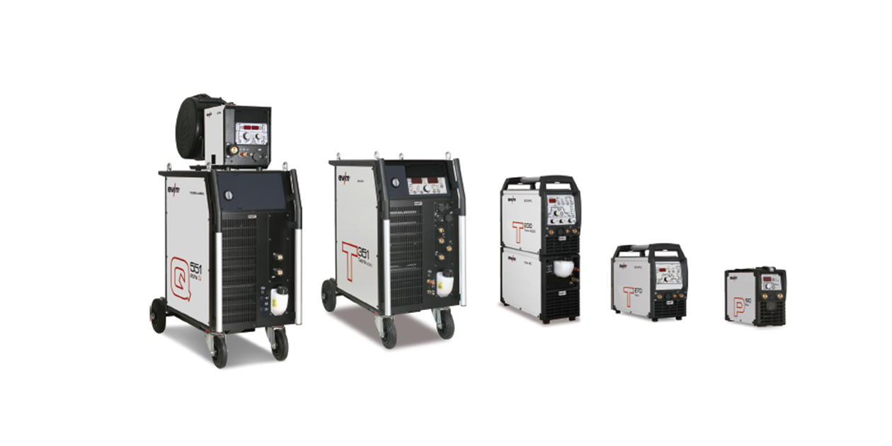
New development of a formal reduced company logo. Continuation of the red bar from the original logo that has been communicated for many years. Quotation: Susanne Szczesny-Oßing, Manager of EWM. With our new appearance we want to stand out more strongly
from the competition and emphasise our focus on innovation! New logo, change of the colour of the equipment from red to a bright light grey. The start for a complete new orientation.